Brand Identity · Fishing Resort · 2026
KAI
Fishing Resort
The Brief
KAI Fishing Resort sits right on the water, with rooms, its own dock and a restaurant for guests after a day out fishing. The brand needed to carry that mix. Not a fishing-shop cliché with nets and neon, but not a sterile hotel chain either. The team workwear in particular had to work just as well on the dock as at the restaurant table.
The Approach
The logo builds from geometric blocks in warm earth tones between terracotta and chestnut. That reads more like a wooden dock at dusk than a tackle shop. On the polo shirts, the wordmark sits small on the chest and large across the back, so the team stays recognizable from a distance.
 Logo & WordmarkGeometric block letters
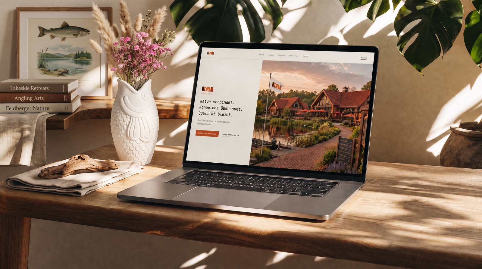 WebsiteBooking & resort overview
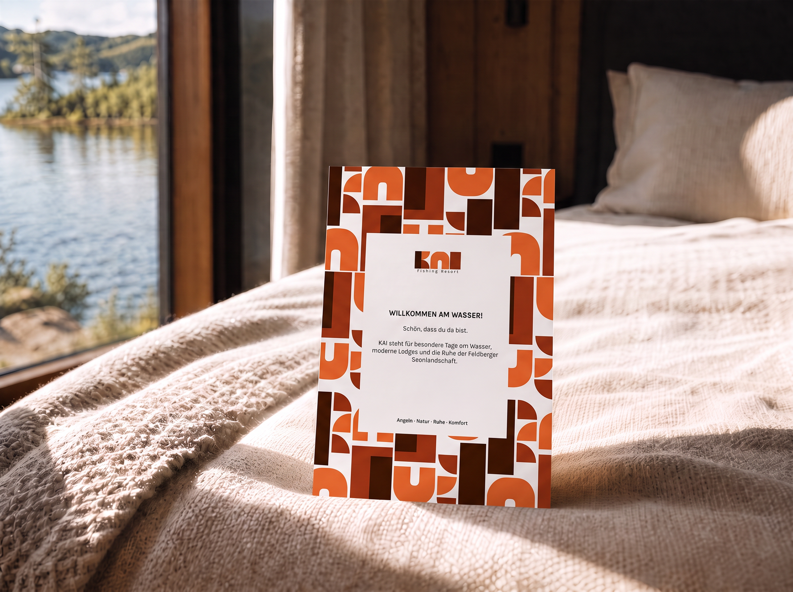 Welcome CardThe first greeting in the room
A resort you recognize from the dock, not just at the front desk.
Concept & Execution, Chiaro Creative