Brand Identity · Dental Practice Branding · 2026
Zahnärzte
Korves
The Brief
Zahnärzte Korves has been around in Lingen for years, but the old look had started to feel older than the practice itself. Patients needed to see, at a glance, modern treatment, but still the same practice they already trust.
The Approach
The old tooth symbol became a stripped-down circle-and-triangle mark, one that doesn't shout "dental practice" anymore and still stays instantly recognizable, on letterhead, business cards, and the new website alike. The blue stays calm and clinical without feeling cold, and carries the line "Trusted, friendly & skilled" through every touchpoint.
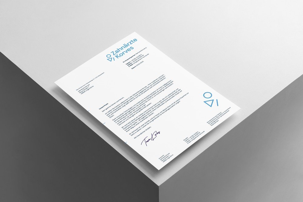
 LetterheadPractice communication in the new look
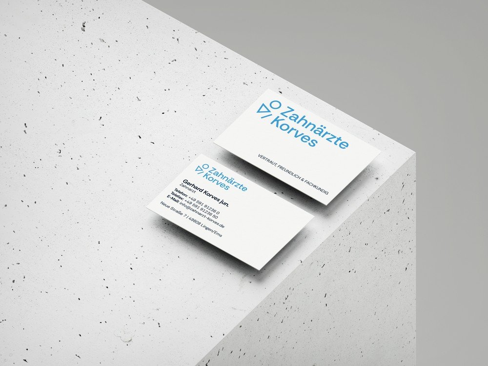
 Business CardGerhard Korves jun., Lingen/Ems
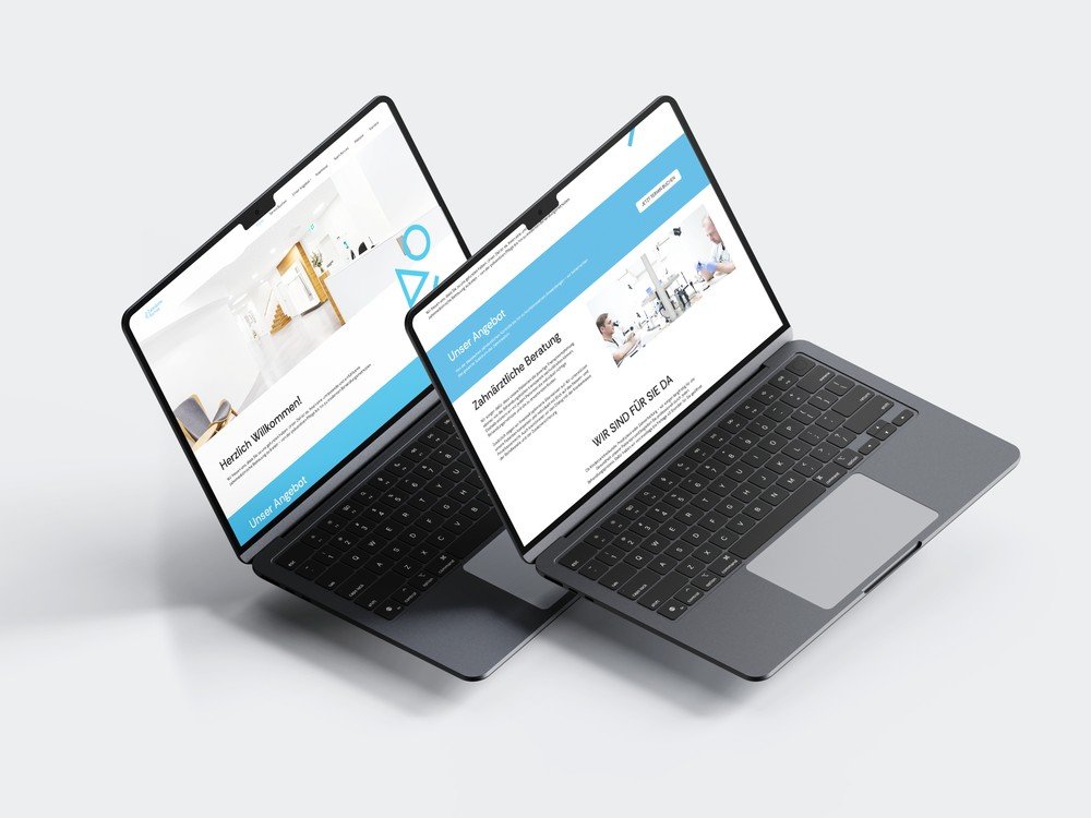
 Practice WebsiteNew front desk & consultation pages
Trust doesn't need a tooth symbol stuck in 1995.
Concept & Execution, Chiaro Creative